See how Google is tracking your location. With Python, Jupyter, Pandas, Geopandas and Matplotlib
In sales, you can hear the acronym ABC: Always Be Closing. Closing means making a deal with a customer. Last decade gave rise to another acronym ABCD: Always Be Collecting Data. We use Google for mail, maps, photos, storage, videos, and much more. We use Twitter to read a stream of consciousness of one President. We use Facebook for messaging and… well, pretty much it. Our parents use it though. We use TikTok… I have no idea what for. Actually, turns out most of the above are useless… Nevermind, the bottom line is: we use them. We use them, and they are free. In XXI-century economy, if you are not paying for the product, you are the product. So, long story short, I wanted to investigate how much Alphabet corporation, the owner of Google, knows about me. Just a tiny fraction, I looked at geolocation history. I never turned off location services because I was valuing comfort over privacy. Bad idea.
Download your data
In order to download all data Google collected about you, go to takeout.google.com and choose what you are interested in. I’m afraid my laptop’s hard drive is not big enough to download everything, so I chose location history only. This data alone is nearly 300 MB in JSON format. If you don’t want to download all, you can watch it real-time. Facebook also collects your location data, which you can see here. The download option is also available. Mine is 1.4 MB, so much less, but your mileage may vary. Having this data in place, let’s analyze it somehow.
Enter Jupyter Notebook
In 2020, parsing JSON and making pretty graphs is called data science. I want to be a scientist! Before we begin, we need some essential tools: Python, Jupyter Notebook and some modules for data manipulation:
brew install python3
pip3 install jupyter pandas geopandas matplotlib descartes
Now let’s run Jupyter Notebook with jupyter notebook command (that was
unexpected…) Jupyter is basically a visual REPL that support Python
and a few other languages. It’s very handy for data exploration and can
produce pleasantly looking documents mixing code, text and
visualizations. All within your web browser.
Parsing location JSON file
Google provides a gigantic JSON array that looks more or less like this:
"locations" : [ {
    "timestampMs" : "1387457266881",
    "latitudeE7" : 521490489,
    "longitudeE7" : 208043723,
    "accuracy" : 15
}, {
    "timestampMs" : "1387457271865",
    "latitudeE7" : 521490030,
    "longitudeE7" : 208044464,
    "accuracy" : 10,
    "activity" : [ {
    "timestampMs" : "1387457280733",
    "activity" : [ {
        "type" : "STILL",
        "confidence" : 77
    }, {
        "type" : "UNKNOWN",
        "confidence" : 20
    }, {
        "type" : "IN_VEHICLE",
        "confidence" : 2
    } ]
    } ]
}
Pretty much what you’d expect, lat/long (multiplied by 10^7^), timestamp and accuracy. Also, some data points have extra metadata about activity Google believes you performed in that location. With 77% confidence I was standing still. Let’s load this huge file into memory and clean it up a little bit:
import pandas as pd
import numpy as np
import geopandas as gp
import shapely.geometry as sg
import datetime as dt
from matplotlib import cm
from matplotlib.lines import Line2D

def extract_activity(record):
    try:
        return record["activity"][0]["activity"][0]["type"]
    except:
        return "MISSING"

def parse_json(json):
    points = [sg.Point(xy) for xy in zip(json.locations.apply(lambda x: x["longitudeE7"] / 10000000),
                                    json.locations.apply(lambda x: x["latitudeE7"] / 10000000))]
    df = gp.GeoDataFrame(geometry=points)
    locations = json.locations
    df["timestamp"] = locations.apply(lambda x: pd.to_datetime(x["timestampMs"], unit='ms'))
    df["accuracy"] = locations.apply(lambda x: x["accuracy"])
    df["velocity"] = locations.apply(lambda x: x.get("velocity", None))
    df["heading"] = locations.apply(lambda x: x.get("heading", None))
    df["altitude"] = locations.apply(lambda x: x.get("altitude", None))
    df["activity"] = locations.apply(extract_activity)
    return df

%time df = parse_json(pd.read_json("Location history.json"))
Parsing and cleaning up JSON is what I do for a living. However, in the
realm of data science, this is called feature extraction. I like
that much more. OK, that’s not technically what feature extraction
is,
but it makes me feel better. Essentially I’m parsing lat/long
coordinates into shapely.geometry.Point data structure, parse
timestamps and try to extract activity, if available. Nothing fancy.
This yields a table (or, should I say, a DataFrame) with… 1 million
observations, throughout 8 years. Scary. Looking at this raw data is
pointless, obviously, we’d like to put it on a real-world map!
Plotting world map
Turns out we need a so-called shape file with borders to draw. I found them somewhere and, after many iterations, managed to draw a squashed world map:
# http://thematicmapping.org/downloads/world_borders.php
world = gp.read_file('./TM_WORLD_BORDERS-0.3/TM_WORLD_BORDERS-0.3.shp')

def draw_map(df, box):
    box_only = df[df.geometry.within(box)]
    minx, miny, maxx, maxy = box.bounds
    base = world.plot(color='white', edgecolor='silver', figsize=(16,16))
    base.set_xlim(minx, maxx)
    base.set_ylim(miny, maxy)
    ax = box_only.plot(ax=base, marker='o', markersize=8)
df is a DataFrame with location observations, whereas box
represents rectangle we are interested in. This will support zooming in
the future. This is the result:
It’s… something. My main concern is that my data spans years 2013-2020. I visited some of these places years ago, while other locations have data points just yesterday. It would be great to somehow distinguish between trips far in the past from very recent ones. For example, using different colours. Moreover, rather than statically assigning a few colours to months and years, I’d rather have a smooth palette that dynamically adjusts to data. This took me a while, but here is an enhanced version:
def seconds(timestamp):
    return timestamp.to_pydatetime().timestamp()


def calculate_pal(df2, cmap):
    min_ts = seconds(df2.timestamp.min())
    max_ts = seconds(df2.timestamp.max())
    return df2.timestamp.apply(lambda ts: cmap((seconds(ts) - min_ts) / (max_ts - min_ts))).tolist()


def compute_legend(df, ax, cmap, steps):
    vals = [x / (steps - 1) for x in range(steps)]
    custom_lines = [Line2D([0], [0], color=cmap(step), lw=4) for step in vals]
    labels = [df.timestamp.quantile(step).strftime("%Y-%m-%d") for step in vals]
    ax.legend(custom_lines, labels, loc="lower right")


def draw_map(df, box):
    box_only = df[df.geometry.within(box)]
    minx, miny, maxx, maxy = box.bounds
    base = world.plot(color='white', edgecolor='silver', figsize=(16,12))
    base.set_xlim(minx, maxx)
    base.set_ylim(miny, maxy)
    cmap = cm.get_cmap('viridis')
    pal = calculate_pal(box_only, cmap)
    ax = box_only.plot(ax=base, marker='o', color=pal, markersize=8)
    compute_legend(box_only, ax, cmap, 5)
calculate_pal() assigns a colour to every data point based on where it
is on the time scale. Oldest points are dark blue/violet. Newest are
yellow with green in between. I also managed to build a dynamic legend.
Enough, show me the map!
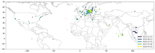
draw_map(df, sg.box(-140, -20, 140, 70))
Let’s explore my locations!
You can see that I most likely live somewhere in central Europe. Let’s zoom a little bit:
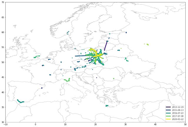
draw_map(df, sg.box(-10, 30, 50, 70))
Yup, that’s Poland right there in the middle. Zooming in:
draw_map(df, sg.box(14, 49, 24, 55))
All right, I hope you know where Poland is, but locating its capital might not be that straightforward. As you can see, I live in Warsaw, the place where all my journeys start. This star-like structure represents various trips and vacations. For example at least three trips to the north by the seaside. Straight lines are the two times I forgot to turn off GPS on a plane. OK, so let’s see where I live:
draw_map(df, sg.box(20.6, 52, 21.3, 52.5))
Oh, sorry, this was Jason Pollock's painting. This is what I meant:
Zooming in a little bit reveals three hot spots: north, south-west and central-east. They represent my current and previous apartment, as well as the city centre, where I work:
draw_map(df, sg.box(20.88, 52.17, 21.05, 52.32))
Extracting activity
We also extracted activity information, remember? Do you want to see
only data points identified as IN_VEHICLE (by bus or driving a car)?
draw_map(df[df.activity == 'IN_VEHICLE'], sg.box(20.88, 52.17, 21.05, 52.32))
Look how different the map is when only ON_FOOT activity is taken into
account:
draw_map(df[df.activity == 'ON_FOOT'], sg.box(20.88, 52.17, 21.05, 52.32))
This makes sense, I use a bus or a car to drive long distances whereas going on foot is more focused on a single area. Except for the triangle in the bottom half… (?) Around 2016 (have a look at the legend) I was jogging about 10 km from office to my flat. And Google knows this.
More insights
This is how a neighbourhood around my previous apartment looks like:
draw_map(df, sg.box(20.88, 52.17, 20.93, 52.22))
draw_map(df, sg.box(20.895, 52.19, 20.915, 52.21))
You can clearly see where my flat is located, as well as every single street. One more interesting finding: I moved out of this place around 2016. However, there are very few yellow points from 2020. Turns out there is a railway track nearby that I use when travelling to Kraków, Poznań or Gdańsk. OK, what about some travels and vacations? Looking at raw GPS data is more enjoyable than family photos! This is a fantastic JCrete (un)conference:
draw_map(df, sg.box(23.4, 35.15, 24.3, 35.65))
Apparently, I’ve been there twice in 2016 and 2017, however, in 2016 the data is much narrower. Makes sense, since 2017 mobile roaming became essentially free in European Union so my phone had much more opportunities to spy on my location. A year earlier I was offline most of the time. More interesting maps: holidays in Sri Lanka:
draw_map(df, sg.box(79.5, 5.5, 81.7, 9))
…and Thailand/Cambodia/Vietnam:
draw_map(df, sg.box(95, 6, 112, 17))
As you can see, I like to wander around during my vacations.
How much data Google collected, by day?
One million data points over 8 years make a few hundred locations collected daily, on average. However, it varies greatly. I wanted to find days when Google collected way more data:
def dt_to_date(dt):
    return dt.date()

def aggregate_by(df, fun):
        tuples = [(activity, df[df.activity == activity].groupby(df.timestamp.apply(fun)).activity.agg('count'))
            for activity
            in df.activity.drop_duplicates()]
        return pd.DataFrame(dict(tuples))

by_day = aggregate_by(df, dt_to_date)
by_day.plot(figsize=[20,10])
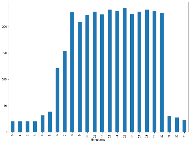
Holy smoke, 3 thousand observations on June 28th, 2016! Let’s split that by hour:
busy_day = df[df.timestamp.apply(dt_to_date) == dt.date(2016, 6, 28)]
busy_day.groupby(busy_day.timestamp.dt.hour).agg('count').geometry.plot.bar(figsize=[12, 9])
Almost 250 data points in just one hour!
Altitude histogram
Last but not least, let’s see a histogram of my altitude over time:
df.altitude.plot.hist(figsize=[20,10], bins=200, log=True)
Mind the logarithmic scale. A mode is around 130 meters, which makes sense - I live in Warsaw. Also, I very rarely visit places above 2000 meters - once again, the highest mountain in Poland is 2499 meters above sea level. Everything above that is either abroad or measurements inside a plane.
Conclusions
OK, drawing a bunch of charts obviously doesn’t make me a data scientist. But it looks cool anyway. Also, it’s kind of depressing how much data we are willing to give away. Keep in mind that this is just a fraction of what one out of many corporations has on me. The complete Notebook, including all images, is available on GitHub. Of course except for raw location data because, you know, I value my privacy…
Tags: geopandas, gps, jupyter, matplotlib, pandas, python


